Pantone's Color of the Year 2017 is Inspired ...by Nature.

Every year (since 2000) Pantone choses a color that reflects the current cultural climate. Their choice of color historically influences trends in a ll facets of design - interior decor ,fashion and architecture.

The color of the year for 2017 is Greenery ( Specifically Pantone 15-0343) Greenery signifies beginnings : A fresh new year;healthier food resolutions;grass and the outdoors of spring and summer. But most prominently the yellow green hue comments on the concept of "environment"

Courtesty of Pinterest

"There's a growing desire to reconnect with nature , with what is real and find ways to disconnect from technology. We need a break, We need to stop and breathe. Greenery is about unity and community- connecting to oneself and others and a higher purpose,nature" said Laurie Pressman , vice president of Pantone Color Institute

Coutesy of Pinterest

Pantone calls Greenery " Nature's Neutral" and is typically associated with spring and summer - but Pantone is forecasting that this hue will be worn and seen all year long.

Courtesy of Pinterest


Greenery aims to be associated with the 're- words' revive , refresh , restore ,rejuvenate jsut to mention a few. It is certainly fresh and a breath of fresh air from last years' pastel choices.

Design Your Life!

The Right Way to Test Paint Color

It's a common image to see someone tape up hardware store paint samples to the wall or to even paint a large piece of cardboard with their desired new hue to test it out .. but it may not be the best way to choose your new color. Here are a few tried and true ways to make sure you are choosing the right color of paint for your home.


Paint Directly on your wall : This tip is true for both interior and exterior walls. Painting directly on your wall versus a cardboard piece for example , allows you to see how your wall will accept the color. Your walls are uniquely textured and cardboard piece , or sample from the store will not reflect the color in the same way. If you are in between two or more colors - paint your sample swatches with a bit of space in between to be able to really get a sense of the color. Color swatches are best done in a square of at least one foot to fully show the color.

Painting swatches with a negative space in between helps your eye see each color.


Paint Two Coats : On your wall sample go the extra step and paint two coats .. most likely you will need two coats of your color and seeing it with just one is not a true sense of how the color will apply. For certain saturated hues - use a primer beforehand on the area you will be painting the sample colors.

For saturated hues .. use two coats and a primer on your swatch samples.

Photo courtesy of Sherwin Williams


Paint Multiple Walls : The colors you are testing will read differently on different walls - especially in walls with direct sunlight. The best way to see how they will look in these conditions is to paint multiple walls. As you view the colors, make sure you consider what time of day you’ll most often be in the room. You want to like how the color looks at that time.

This room is exposed to many different light sources, including natural light at different times during the day. It is important when choosing color for a room such as this one to paint swatches on multiple walls to ensure the color works.

Photo courtesy of Pinterest


Happy Painting !

Kate Spade Introduces Home Furnishings .. and They are Fabulous!

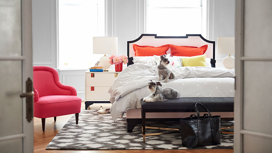
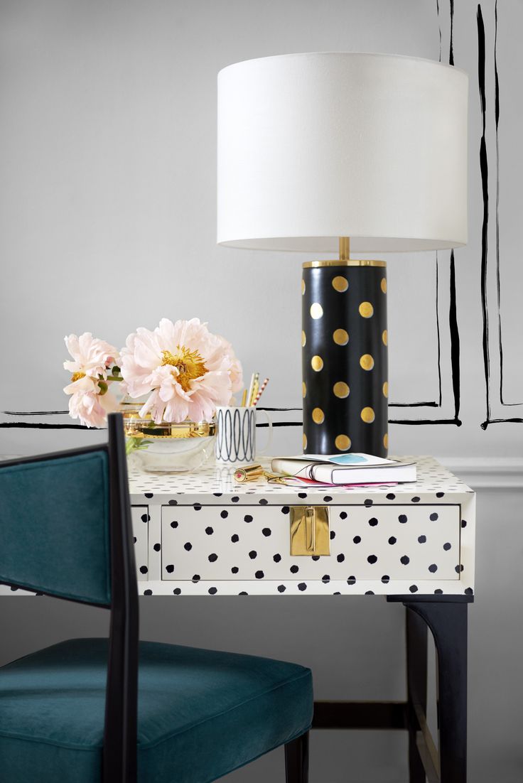
Kate Spade has been on the fashion scene for decades, but has recently added furnishings and home accessories to her empire. Her signature black+ white designs are now being applied to interiors , along with whimsy and pops of color. They are gorgeous ! Have a look ! These are from the fall 2015 collection and I for one am very excited to see what comes next ..