Making an Entrance !

Do you ever feel that something is missing from your home's entry ? Maybe it's hard to see the front door ? or your entry way is just plain lacking style ? .... here are some tips to help your home - Make an entrance !!


Photo courtesy of Pinterest

# 1 Make the most of your front door - Your front door is one of the first impressions guests have of your home and sets the stage for what they may see next.  Make sure your front door is visible - add additional lighting on the sides of the door and above to give a full view at night. Add color to your door to make it stand out - That being said you can take the color more subtle or highly saturated - its up to you but a good rule of thumb is to make sure it fits into the color palette of your home. And last but not least - add details ! In the above picture you see two large planters that compliment the style of the home and add symmetry to the door.

Photo courtesy of Pinterest

#2 Think about the interior door - Painting the backside of your front door in a pop of color to compliment the entry way is an unexpected way to add style! The above picture shows just how much impact this can give to your entry way - Bonus - tying the color into an area rug really makes this work !

Photo courtesy of Pinterest

# 3 Adding Texture - In an entry way texture can be introduced in many ways - above the textured grass wallpaper sets the mood for this home. You can also add texture with woven baskets - high pile area rugs and much more. Texture is a great way to make introduction to your home - especially for those who prefer a more monochromatic palette.

Photo courtesy of Pinterest

# 4 Let there be light - Don’t skimp on your foyer lighting. Select a fixture that makes a statement and defines the area, as does this handsome lantern.


In closing , your entryway is the first introduction your guest have to your beautiful home ! Why not make the most of it ? Design Your Life!



Source: MakinganEntrance

4 Steps to Picking the Best Sofa

The challenge of choosing a sofa of good quality and style can be overwhelming ... but it doesn't have to be if you follow these simple steps......


Photo courtesy of Pinterest


1.) Check the Framing - A good frame is the key to a long lasting sofa. Look for frames made of kiln-dried hardwood ( oak , ash and beech are good examples) Avoid frames made of particleboard , plastic or metal as these can warp and crack. Soft woods , such as pine are typically low cost but may warp in as little as five years.

Tip - To test frame strength , lift one corner or leg of the sofa off the floor. By the time you have raised the sofa 6 inches , the other leg should have risen as well - If it is still touching the floor - the frame has too much give and is weak


Sofa Construction - Photo courtesy of Pinterest


2.) Ask About the Joints - A sofa frame with joints connected by any of the following means it is solidly constructed : wooden dowels , double wooden dowels , wooden corner blocks ( corner blocks glued and screwed) metal screws and brackets. Nails or staples might be used for reinforcing the frame - but never purchase a sofa that is soley held together by staples , nails or glue. Make sure to get written manufacturer information on frame joinery.


3.) Test out the Springs - Most sofas on the market are featuring sinuous springs ( also called S-springs or serpentine springs) These springs are units of snaking wire and are nicely supportive depending on the gauge of metal used. If choosing an s-spring sofa make sure to ask about the metal as well as the back springs ( to cut costs , some manufacturers list a sofa as a sinuous spring but the back might still be webbed with mesh - which willnot be as supportive as a spring system) High end sofas often come with an "eight way hand tied spring" system. The main advantage to this system is that the springs are manufactured like a small mattress underneath and give even distribution for weight. The best way to find what is right for you is to make sure to feel the springs through the upholstery - they should be close together and offer support. Sofas without springs - just webbing or mesh will breakdown quickly and are to be avoided.

Tip - Sit down on a corner or edge of the sofa you are considering - If you hear squeaks and creaks this suggests that the springs are not placed well and may be hitting the frame


Photo courtesy of Pinterest

4.) Feel the Fillings - Sofa cushions can be made of many things and new innovations are popping up everyday but here are a few tried and true options.. When looking for a cushion filling make sure to ask what your options are ( many manufacturers offer a variety suited to different needs ) Standard cushions are often made with a combination of foam fill and Dacron wrapping and are a great durable option , If you like your seat cushion a bit firmer - you may want to consider an extra firm option - which is similar to a standard cushion just using a higher density foam ( make sure to ask a representative for an HD foam ) , Blend down adds a wrap of down ( usually encased to make sure feathers are not poking through the surface) around a foam cushion - and if you like a more springy or bouncy seat ask about trying a spring down cushion which will have springs encased int he foam surrounded by down . If at all possible do a seat test in a showroom to explore options , everyone sits differently and it is all about finding the right fit for you.

With these tips you will be able to pick the right sofa for your needs and that will stand the test of time. 

Design Your Life ! 

You Have Style and So Should Your Laundry Room!

One of the most overlooked spaces in most homes is also one of the spaces we spend a good amount of time in. Like it or not .. it's your Laundry Room. Make fluffing and folding more fun with these helpful tips and tricks to decorate this often-neglected space.

#1 Add Wallpaper - Small spaces are where you will get more bang for your buck. Updating even just one wall in your laundry room will give you lots of style - And since most laundry rooms are fairly isolated it gives you a chance to really go bold !

#2 Have fun with flooring - As with the wallpaper - flooring can be bold in a small space. Laundry rooms are a great area for statement tile .

#3 The Devil is in the Details - Adding details in the laundry room can be easy and have a great impact. One way to do that is adding a great back splash ! With so many back splash options you can really personalize the look of your laundry room.

#4 Continue the look and feel of your home - If your home is open and contemporary - continue the look into your laundry room. Making it flow is as easy as looking to your own home for inspiration.

#5 Add color to your appliances - It seems these days we are seeing lots of color options when it comes to appliances - and this is good news for spicing up your laundry room - adding a color appliance can add a pop of color and is a great starting off point to pull the room together.

Happy Laundry Day ! Let us know how you plan to make your laundry room special.

Design Your Life!


credit : photos courtesy of Pinterest


Pantone's Color of the Year 2017 is Inspired ...by Nature.

Every year (since 2000) Pantone choses a color that reflects the current cultural climate. Their choice of color historically influences trends in a ll facets of design - interior decor ,fashion and architecture.

The color of the year for 2017 is Greenery ( Specifically Pantone 15-0343) Greenery signifies beginnings : A fresh new year;healthier food resolutions;grass and the outdoors of spring and summer. But most prominently the yellow green hue comments on the concept of "environment"

Courtesty of Pinterest

"There's a growing desire to reconnect with nature , with what is real and find ways to disconnect from technology. We need a break, We need to stop and breathe. Greenery is about unity and community- connecting to oneself and others and a higher purpose,nature" said Laurie Pressman , vice president of Pantone Color Institute

Coutesy of Pinterest

Pantone calls Greenery " Nature's Neutral" and is typically associated with spring and summer - but Pantone is forecasting that this hue will be worn and seen all year long.

Courtesy of Pinterest


Greenery aims to be associated with the 're- words' revive , refresh , restore ,rejuvenate jsut to mention a few. It is certainly fresh and a breath of fresh air from last years' pastel choices.

Design Your Life!

Fall Market at the Laguna Design Center

 We had a great time previewing great new collections of furniture , fabrics and more at the annual Fall Market at the Laguna Design Center.  Here is a little video of some of the beautiful and unique things we saw. It is always so fun to see the new trends in design and to learn more about all of the great showrooms at the Laguna Design Center.

Happy Fall and Enjoy !

Adding Fall Decor to Your Home

As the great F.Scott Fitzgerald said " Life starts all over again when it gets crisp in the fall" .. As we transition to fall now is the perfect time to celebrate the season in your home. Here are a few ways to add the magic of fall to your home.

Add a wreath to the front door to welcome guests! This 'Rosehips Wreath' from Pottery Barn is simple and elegant

Add candlelight to any spaceThese 'Arlington Hurricanes' from Pottery Barn are a great way to do so - and add a metallic touch 

Add candlelight to any space

These 'Arlington Hurricanes' from Pottery Barn are a great way to do so - and add a metallic touch


Cozy up with a warm throw. These throws from the Faux Fur collection at Williams and Sonoma Home are soft and add texture to the home.

Cozy up with a warm throw. These throws from the Faux Fur collection at Williams and Sonoma Home are soft and add texture to the home.

Add a whimsical touch to the dining table with these 'Give Thanks' napkin rings from Pottery BarnGreat fall decor and a reminder to be grateful!

Add a whimsical touch to the dining table with these 'Give Thanks' napkin rings from Pottery Barn

Great fall decor and a reminder to be grateful!

Happy Fall !

The Right Way to Test Paint Color

It's a common image to see someone tape up hardware store paint samples to the wall or to even paint a large piece of cardboard with their desired new hue to test it out .. but it may not be the best way to choose your new color. Here are a few tried and true ways to make sure you are choosing the right color of paint for your home.


Paint Directly on your wall : This tip is true for both interior and exterior walls. Painting directly on your wall versus a cardboard piece for example , allows you to see how your wall will accept the color. Your walls are uniquely textured and cardboard piece , or sample from the store will not reflect the color in the same way. If you are in between two or more colors - paint your sample swatches with a bit of space in between to be able to really get a sense of the color. Color swatches are best done in a square of at least one foot to fully show the color.

Painting swatches with a negative space in between helps your eye see each color.


Paint Two Coats : On your wall sample go the extra step and paint two coats .. most likely you will need two coats of your color and seeing it with just one is not a true sense of how the color will apply. For certain saturated hues - use a primer beforehand on the area you will be painting the sample colors.

For saturated hues .. use two coats and a primer on your swatch samples.

Photo courtesy of Sherwin Williams


Paint Multiple Walls : The colors you are testing will read differently on different walls - especially in walls with direct sunlight. The best way to see how they will look in these conditions is to paint multiple walls. As you view the colors, make sure you consider what time of day you’ll most often be in the room. You want to like how the color looks at that time.

This room is exposed to many different light sources, including natural light at different times during the day. It is important when choosing color for a room such as this one to paint swatches on multiple walls to ensure the color works.

Photo courtesy of Pinterest


Happy Painting !

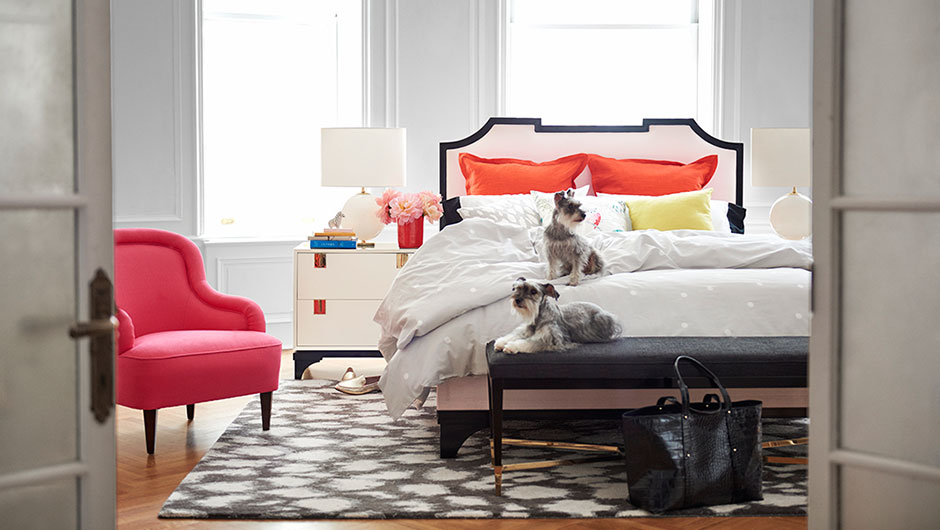
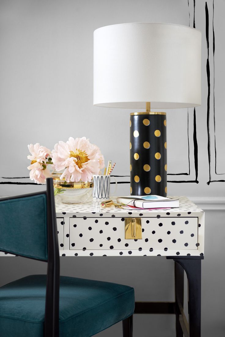
Kate Spade Introduces Home Furnishings .. and They are Fabulous!

Kate Spade has been on the fashion scene for decades, but has recently added furnishings and home accessories to her empire. Her signature black+ white designs are now being applied to interiors , along with whimsy and pops of color. They are gorgeous ! Have a look ! These are from the fall 2015 collection and I for one am very excited to see what comes next ..


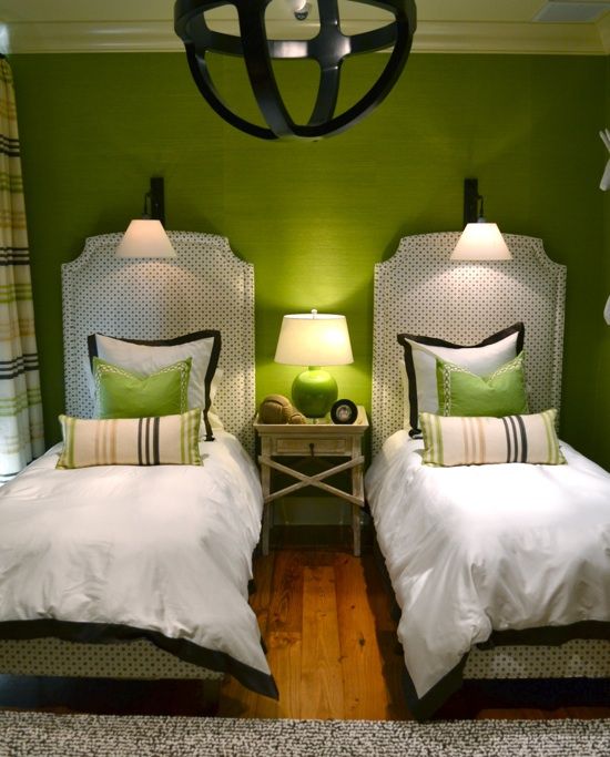
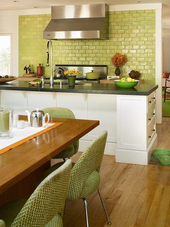
Color Crush : Apple Green

Recently , while browsing a copy of House Beautiful - I came across an article highlighting the color Apple Green. It immediately caught my eye. Apple Green is a fresh & happy green, and best of all can be paired with many colors to create new effects. It is also a very profound color in color psychology.

This is the color of balance and harmony. From a color psychology perspective, it is the great “balancer” of the heart and the emotions, creating equilibrium between the head and the heart
— empoweryourselfwithcolorpsycology.com

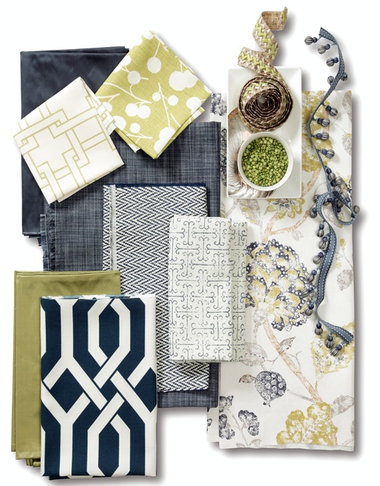
Here are some stunning examples of Apple Green in interiors